
Portal Rodent Abundance Demo
Hao Ye
2026-01-29
Source:vignettes/rodent-abundance-demo.Rmd
rodent-abundance-demo.RmdIntroduction
This vignette is a basic guide to begin exploring the Portal data. We load in the data (making sure that we’re using the most recent copy from GitHub), and then explore the rodent abundances over time, with a comparison between the “control” and “kangaroo rat exclosure” treatments.
Retrieving the Data
Note that this package does not contain the actual Portal data, which resides online in a GitHub repository.
First, we try to load the data. If there isn’t a Portal folder, than
load_rodent_data will fall back to downloading the data, as
well.
check whether we already have the data. If we don’t have the data, or
if the version we have isn’t the most recent, we use the
download_observations function to download the latest copy
of the data.
portal_data_path <- tempdir() # use a temporary folder to store downloaded data
data_tables <- load_rodent_data(portal_data_path, download_if_missing = TRUE)
#> Warning in load_datafile(file.path("Rodents", "Portal_rodent.csv"), na.strings = "", : Proceeding to download data into specified path/tmp/RtmpKvdBEx
#> Downloading version `6.48.0` of the data...
#> Loading in data version 6.48.0
The load_rodent_data function reads in several tables
related to the rodent abundances. We won’t necessarily use all of these
tables, but loading this now gives us access later.
Rodent Abundances
The first table that we loaded (data_tables$rodent_data)
is a record of whatever was found in the traps, mostly rodents, but also
a few other taxa. If we just wanted to get the rodent abundance data, we
could use the abundance function, which has default
arguments to filter out the non-rodents.
# get rodent abundance by plot
rodent_abundance_by_plot <- abundance(path = portal_data_path, time = "date", level = "plot")
#> Loading in data version 6.48.0

rodent_abundance <- rodent_abundance_by_plot %>%
  gather(species, abundance, -censusdate, -treatment, -plot) %>%
  count(species, censusdate, wt = abundance) %>%
  rename(abundance = n)
print(summary(rodent_abundance))
#>    species            censusdate           abundance
#>  Length:9765        Min.   :1979-09-22   Min.   :  0.000
#>  Class :character   1st Qu.:1990-02-24   1st Qu.:  0.000
#>  Mode  :character   Median :2000-02-05   Median :  0.000
#>                     Mean   :2001-01-01   Mean   :  6.884
#>                     3rd Qu.:2011-08-27   3rd Qu.:  5.000
#>                     Max.   :2024-12-07   Max.   :334.000
Let’s convert the data to long format for easier facetting. Also, we want the scientific names instead of the two-letter species codes, so let’s do that matching, too:
join_scientific_name <- function(rodent_abundance,
                                 species_table = data_tables$species_table)
{
  return(rodent_abundance %>%
           left_join(select(species_table, "species", "scientificname"),
                     by = "species") %>%
           rename(scientific_name = scientificname)
  )
}

rodent_abundance <- join_scientific_name(rodent_abundance)
Figure: abundance over time
make_abundance_plot_over_time <- function(rodent_abundance)
{
  return(ggplot(rodent_abundance,
                aes(x = censusdate, y = abundance)) +
           geom_line() +
           facet_wrap(~scientific_name, scales = "free_y", ncol = 3) +
           xlab("Date") +
           ylab("Abundance") +
           scale_x_date(breaks = seq(as.Date("1977-01-01"), to = as.Date("2018-01-01"), "+5 years"),
                        date_labels = "%Y",
                        limits = as.Date(c("1977-01-01", "2018-01-01"))) +
           theme_cowplot() +
           theme(axis.text.x = element_text(angle = 90, hjust = 1, vjust = 0.5),
                 legend.position = "bottom", legend.justification = "center",
                 strip.text.x = element_text(size = 10))
  )
}

my_plot <- make_abundance_plot_over_time(rodent_abundance)

print(my_plot)
#> Warning: Removed 1113 rows containing missing values or values outside the scale range
#> (`geom_line()`).
Monthly abundance of rodents (all plots)
Plot Treatments
A description of the experimental design and treatments can be found in this Readme file in the PortalDate repo.
For now, we are just going to use the Portal_plots
table file to look at how the treatments for individual plots have
changed over time. Note that this file is already loaded in as the
plots_table from the loadData function we ran
previously.
print(summary(data_tables$plots_table))
#>       year          month             plot        treatment
#>  Min.   :1977   Min.   : 1.000   Min.   : 1.00   Length:11948
#>  1st Qu.:1989   1st Qu.: 4.000   1st Qu.: 6.00   Class :character
#>  Median :2000   Median : 7.000   Median :12.00   Mode  :character
#>  Mean   :2000   Mean   : 6.556   Mean   :12.48
#>  3rd Qu.:2012   3rd Qu.:10.000   3rd Qu.:18.00
#>  Max.   :2024   Max.   :12.000   Max.   :24.00
#>  resourcetreatment  anttreatment
#>  Length:11948       Length:11948
#>  Class :character   Class :character
#>  Mode  :character   Mode  :character
#>
#>
#>
We want a proper date variable as well as converting
plot into a factor:
plot_treatments <- data_tables$plots_table %>%
  mutate(iso_date = as.Date(paste0(year, "-", month, "-", "01")),
         plot = as.factor(plot)) %>%
  select(iso_date, plot, treatment)
Figure: plot treatments over time
my_plot <- ggplot(plot_treatments,
                  aes(x = iso_date, y = treatment, color = treatment)) +
  geom_point(shape = 20) +
  geom_vline(aes(xintercept = as.Date("1977-10-01")), linetype = 2) +
  geom_vline(aes(xintercept = as.Date("1988-01-01")), linetype = 2) +
  geom_vline(aes(xintercept = as.Date("2005-01-01")), linetype = 2) +
  geom_vline(aes(xintercept = as.Date("2015-04-01")), linetype = 2) +
  facet_wrap(~plot, ncol = 5) +
  xlab("Date") +
  ylab("Treatment") +
  scale_color_manual(values = rainbow(5)) +
  scale_x_date(breaks = seq(as.Date("1977-01-01"), to = as.Date("2018-01-01"), "+5 years"), date_labels = "%Y") +
  theme_cowplot() +
  guides(color = "none") +
  theme(axis.text.x = element_text(angle = 90, hjust = 1, vjust = 0.5))

print(my_plot)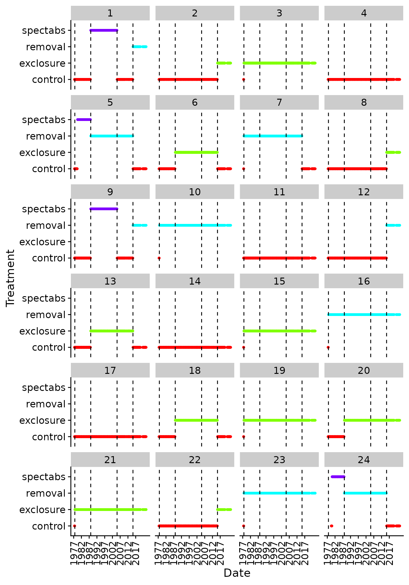
Treatments of Plots by Date
Identifying control plots
The treatments for the plots have changed over time: in some cases, this was due to initial ramping up of the experimental protocol, in others, exclusions of Dipodomys spectabilis were started and then converted back later because the species went locally extinct (e.g. plots 1, 5, 9, 24).
Which plots have always been control plots?
always_control_plots <- summarise_rodent_data(level = "plot",plots = "Longterm") %>%
  group_by(plot) %>%
  summarize(always_control = all(treatment == "control")) %>%
  filter(always_control)
#> Warning in load_datafile(file.path("Rodents", "Portal_rodent.csv"), na.strings = "", : Proceeding to download data into specified path~
#> Downloading version `6.48.0` of the data...
#> Loading in data version 6.48.0

print(always_control_plots)
#> # A tibble: 4 × 2
#>    plot always_control
#>   <int> <lgl>
#> 1     4 TRUE
#> 2    11 TRUE
#> 3    14 TRUE
#> 4    17 TRUE
The plots = "Longterm" argument only returns plots that
have never changed treatment type. Note, however, that this excludes
several plots for which the treatment was changed ~2015. We can include
these plots by filtering by date and testing for the “control” treatment
manually:
mostly_control_plots <- plot_treatments %>%
  filter(iso_date < "2015-01-01",
         iso_date > "1998-01-01") %>%
  group_by(plot) %>%
  summarize(mostly_control = all(treatment == "control")) %>%
  filter(mostly_control)

print(mostly_control_plots)
#> # A tibble: 8 × 2
#>   plot  mostly_control
#>   <fct> <lgl>
#> 1 2     TRUE
#> 2 4     TRUE
#> 3 8     TRUE
#> 4 11    TRUE
#> 5 12    TRUE
#> 6 14    TRUE
#> 7 17    TRUE
#> 8 22    TRUE
And to identify the datespan over which these plots have been controls:
date_span <- plot_treatments %>%
  filter(plot %in% mostly_control_plots$plot) %>%
  group_by(iso_date) %>%
  summarize(all_control = all(treatment == "control")) %>%
  filter(all_control)

print(date_span)
#> # A tibble: 408 × 2
#>    iso_date   all_control
#>    <date>     <lgl>
#>  1 1977-10-01 TRUE
#>  2 1977-11-01 TRUE
#>  3 1977-12-01 TRUE
#>  4 1978-01-01 TRUE
#>  5 1978-02-01 TRUE
#>  6 1978-03-01 TRUE
#>  7 1978-04-01 TRUE
#>  8 1978-05-01 TRUE
#>  9 1978-06-01 TRUE
#> 10 1978-07-01 TRUE
#> # ℹ 398 more rows
Abundances over control plots
We are now ready to plot abundances just over the control plots and the time span in 1977-10-01 to 2015-03-01. We do this by retrieving the abundance data by plot, and then filtering accordingly:
rodent_abundance_by_plot %>%
  filter(censusdate >= min(date_span$iso_date),
         censusdate <= max(date_span$iso_date),
         plot %in% mostly_control_plots$plot) %>%
  select(-treatment, -plot) %>%
  gather(species, abundance, -censusdate) %>%
  count(censusdate, species, wt = abundance) %>%
  rename(abundance = n) %>%
  join_scientific_name() %>%
  {.} -> rodent_abundance_control

rodent_abundance_control %>%
  make_abundance_plot_over_time() %>%
  print()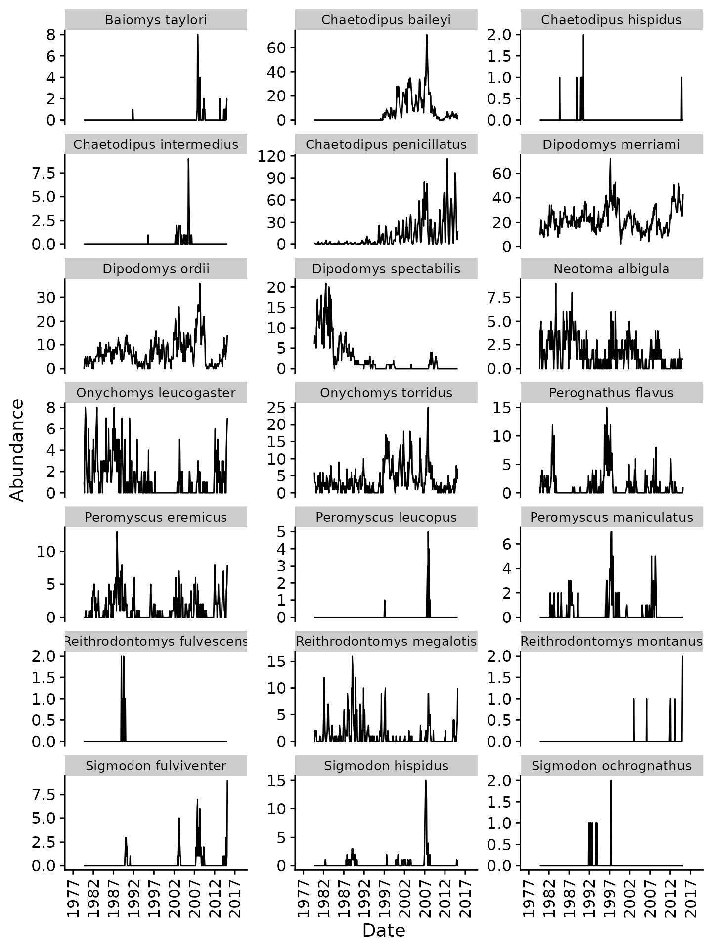
Monthly abundance of rodents (control plots)
Abundances over rodent exclosures
We can do the same with the “exclosure” condition. First, which plots:
mostly_exclosure_plots <- plot_treatments %>%
  filter(iso_date > as.Date("1989-01-01"),
         iso_date < "2015-01-01") %>%
  group_by(plot) %>%
  summarize(mostly_exclosure = all(treatment == "exclosure")) %>%
  filter(mostly_exclosure)

print(mostly_exclosure_plots)
#> # A tibble: 8 × 2
#>   plot  mostly_exclosure
#>   <fct> <lgl>
#> 1 3     TRUE
#> 2 6     TRUE
#> 3 13    TRUE
#> 4 15    TRUE
#> 5 18    TRUE
#> 6 19    TRUE
#> 7 20    TRUE
#> 8 21    TRUE
Then, the datespan:
date_span <- plot_treatments %>%
  filter(plot %in% mostly_exclosure_plots$plot) %>%
  group_by(iso_date) %>%
  summarize(all_exclosure = all(treatment == "exclosure")) %>%
  filter(all_exclosure)

print(date_span)
#> # A tibble: 297 × 2
#>    iso_date   all_exclosure
#>    <date>     <lgl>
#>  1 1988-01-01 TRUE
#>  2 1988-02-01 TRUE
#>  3 1988-03-01 TRUE
#>  4 1988-04-01 TRUE
#>  5 1988-05-01 TRUE
#>  6 1988-06-01 TRUE
#>  7 1988-07-01 TRUE
#>  8 1988-08-01 TRUE
#>  9 1988-09-01 TRUE
#> 10 1988-10-01 TRUE
#> # ℹ 287 more rows
Finally, the figure:
rodent_abundance_by_plot %>%
  filter(censusdate >= min(date_span$iso_date),
         censusdate <= max(date_span$iso_date),
         plot %in% mostly_exclosure_plots$plot) %>%
  select(-treatment, -plot) %>%
  gather(species, abundance, -censusdate) %>%
  count(censusdate, species, wt = abundance) %>%
  rename(abundance = n) %>%
  join_scientific_name() %>%
  {.} -> rodent_abundance_exclosure

rodent_abundance_exclosure %>%
  make_abundance_plot_over_time() %>%
  print()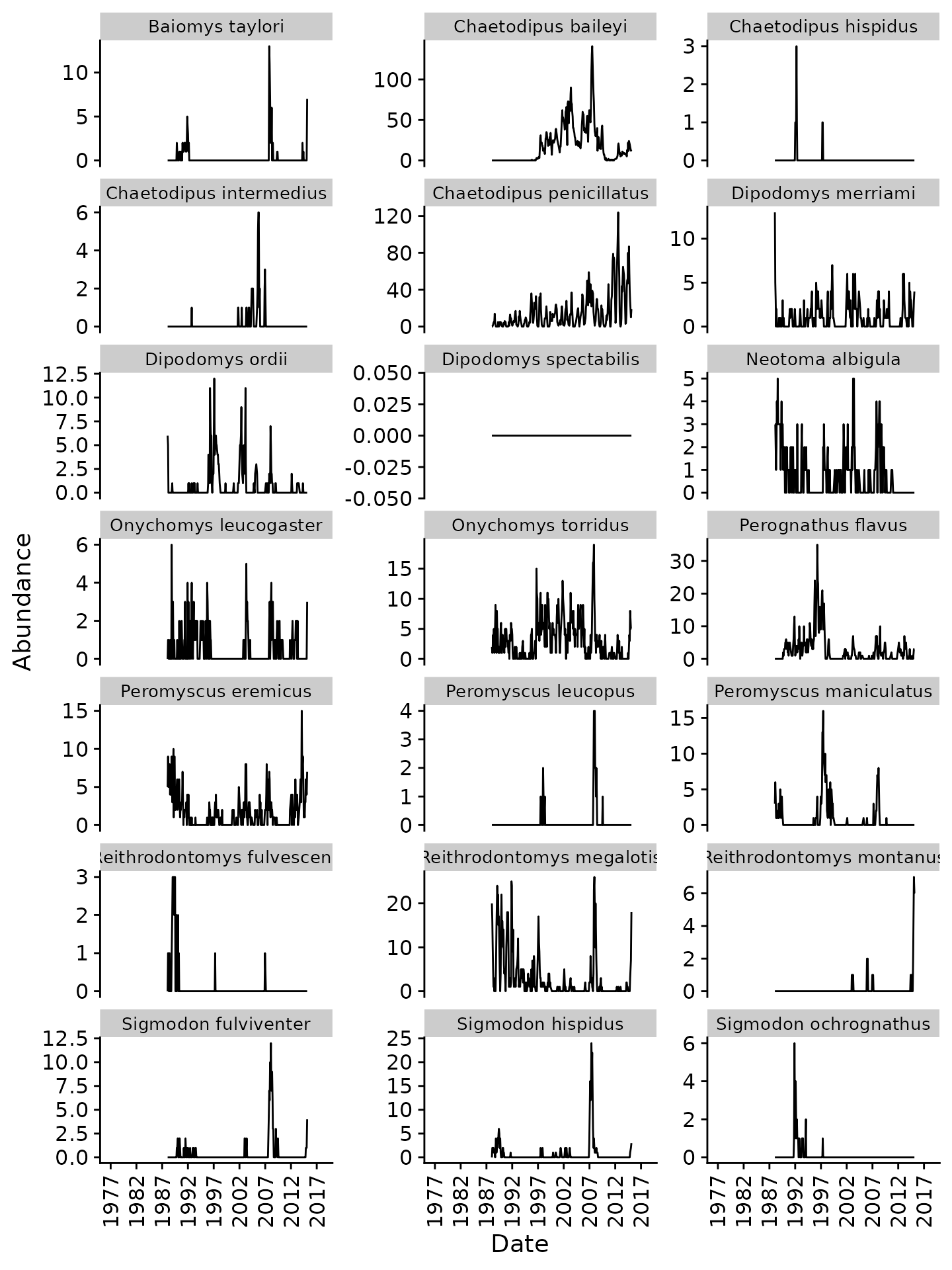
Monthly abundance of rodents (exclosure plots)
Since these data have the same number of plots as the previous figure, we can directly compare abundances. Note the decreased numbers for kangaroo rats (Dipodomys spp.) and increased numbers for some other taxa.
Comparison Figure
Let’s merge the two datasets and produce a combined plot:
rodent_abundance_merged <- bind_rows(
  mutate(rodent_abundance_control, treatment = "control"),
  mutate(rodent_abundance_exclosure, treatment = "exclosure"))

merged_plot <- ggplot(rodent_abundance_merged,
                      aes(x = censusdate, y = abundance, color = treatment)) +
  geom_line() +
  facet_wrap(~scientific_name, scales = "free_y", ncol = 3) +
  xlab("Date") +
  ylab("Abundance") +
  scale_x_date(breaks = seq(as.Date("1977-01-01"), to = as.Date("2018-01-01"), "+5 years"),
               date_labels = "%Y",
               limits = as.Date(c("1977-01-01", "2018-01-01"))) +
  scale_color_manual(values = c("purple", "yellow")) +
  theme_cowplot() +
  theme(axis.text.x = element_text(angle = 90, hjust = 1, vjust = 0.5),
        legend.position = "bottom", legend.justification = "center",
        strip.text.x = element_text(size = 10))

print(merged_plot)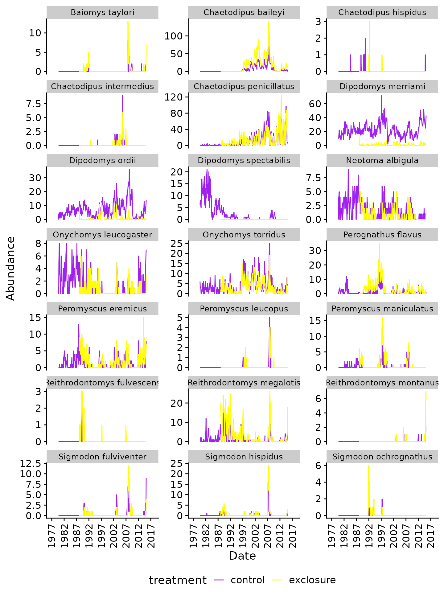
Monthly abundance of rodents (control vs. exclosure plots)
As expected, there are substantially lower counts of kangaroo rats (Dipodomys spp.) in the “exclosure” plots. We also observe very similar abundances for some species, but increases in others (e.g. “Chaetodipus baileyi”, “Perognathus flavus”, “Reithrodontomys megalotis”)